
-
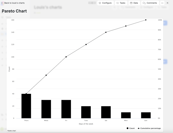
What it shows
A Pareto chart shows the frequency of different levels of a variable, with the most frequent levels at the top. The length of each bar represents the "cost" of each cause, and the bars are arranged in descending order. -
What it's based on
Pareto charts are based on the "80/20 rule", also known as the Pareto principle, which states that 80% of effects come from 20% of causes. -
What it's used for
Pareto charts are used to help identify the most important issues, prioritise problems to solve, and understand data distribution. They are often used in total quality management and six sigma methodologies. -
How it's used
Pareto charts can be used to help companies identify common defects, prioritise fixes, and identify top-performing products. -
What it's not used for
Pareto charts can only show qualitative data that can be observed, and they can't be used to represent quantitative data. They also don't provide solutions to issues, and they only focus on past data.
How to create a Pareto chart
You can create a Pareto chart via the Templates area. Once you have created your Pareto chart, you will be able to begin adding data and configuring it.
To add data to a Pareto chart:
-
Select Add data. The data table will pop out allowing you to being entering data.
To enable 80/20 visualisation:
- Select Configure. The side menu will then pop out
- Scroll down to Chart and select Enable 80/20 visualisation
To enable Cumulative percentage on Data Table:
- Select Data. The data table will pop out allowing you to being entering data.
- Select Configure table. Click the view icon beside Cumulative percentage